 Stampede Design
The emergence of highly content-based websites now means one thing: how to fit the content within a very well-functioned website while not sacrificing the aesthetics? In addition to that, the development of web nowadays mean viewers will be able to view these content across multiple sizes of screens. Such are the challenges of designing in these interesting times.

Like many other artisans, web designers prefer to work within the boundaries of rules – either intuitively or by following a standard practice (e.g. grid structure). While freedom might be good, designing within limitations is a way for designers to know how far the uniformity can be achieved for their designs.
Gestalt is a German word which stands for “essence or shape of an entity’s complete form”. Possibly the most significant and the most powerful principle used in arts and design, the idea of the “gestalt” is a fairly old one to be traced back.
In the midst of designing, there are principles that were uncovered that have indirectly influenced designers in the process of their creating. One way to help designing content-based design is to refer to The Gestalt Principle of Design and to understand why it is essential to know how gestaltism influences our content design.
Later in the article, we shall be presenting a revelation that online readers, in a nutshell, do not read (gasp!), why they don’t, and how can we use that to our advantage in designing a content-based website.
yeah.
Part 1: The Gestalt Design Principle
Gestalt is a German word which stands for “essence or shape of an entity’s complete form”. Possibly the most significant and the most powerful principle used in arts and design, the idea of the “gestalt” is a fairly old one to be traced back. The principle originated from early 20th century philosopher Christian von Ehrenfels along with his contemporary partner, psychiatrist Max Wertheimer, among others.
Simply stating that the whole is greater than its parts, the Gestalt design principle is meant to describe how the mind organises visual data and how best we should design in order to achieve the best effect.
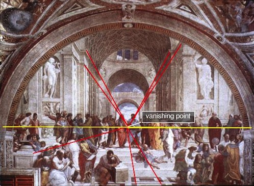
Example of Gestalt design principles in use: Raphael’s School of Athens incorporating a clear sense of figure-ground
In the world of web design, this principle helps to take the guesswork out of design. While many experienced designers are able to design well by eye, untrained designers may find themselves lost and only being left with the design samples found on the web, perusing the same layouts over and over again. This is where understanding Gestalt design principle will be useful in designing content-based websites.
The 5 principles in Gestalt
- Proximity, Uniform Connectedness and Good Continuation
- Similarity
- Prägnanz (Figure-Ground)
- Common Fate
- Closure
Proximity, Uniform Connectedness and Good Continuation
Consider this: why are you still reading? Aside from the fact that somebody recommended you this article or you landed here somewhere while searching about the theory of Gestalt, it is also due to the fact that this article was properly articulated, grouped and structured.
Bragging aside, this is also contributed by the principles of proximity, uniform connectedness and good continuation. To easily define them, the concept underlying these principles is grouping. When we have a group of objects, we tend to see them as forming coherent groups and we decide whether they would make sense or not.
Proximity: When elements are positioned close to one another, they are seen as part of a group rather than as individual elements.
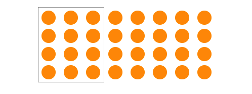
Uniform connectedness: We understand the same coloured elements bounded within the box are seen to be more related than the rest.
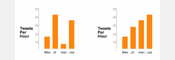
Easier to Digest: In good continuation, the graph on the right is easier to digest since it suggest a continuous data organisation rather than the one on the left.
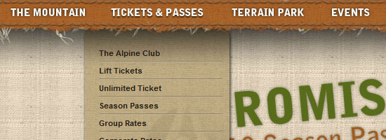
In web design, one example of employing these principles is with navigational links, where not only do we keep the navigation links together, but also group them internally, putting links to similar pages together, categorising them into sub-categories, and so on.
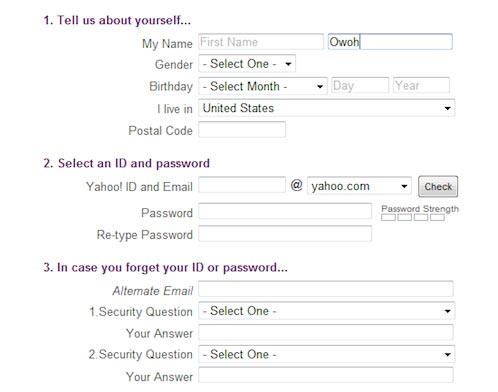
Another example is in web forms. In this web form from Yahoo!, notice how the form is grouped into three segments: personal information, ID generation, and alternate ID provision.
One way to employ these principles is also by designing by grid. A grid is not only useful as a guideline in bringing order to a layout, but it also is useful in indicating context and the hierarchy of the content of the website. Hence these three principles are safely preserved.
Similarity
We often group things perceptually when we see elements which appear similar to one another. As a designer, the ability to be familiar with all the ways similar things can be seen will help us to choose the right similarity element to exploit. This is because, according to Andy Rutledge, “the different modes of similarity are not created equal. Some are strongly communicative while others are comparatively weak.”
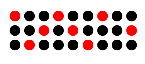
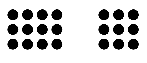
Similarity vs Dissimilarity: Red circles are seen as related to the other red circles and black circles to black circles due to the similarity in color. Red and black circles are seen as dissimilar to each other even though they’re all circles.
By employing the principle of similarity, it could help web designers to provide visual cues as to which elements are similar to one another. Hence, through this relation, viewers or end users will be able to perceive the organisation and interact with the elements accordingly.
One way to use the principle of similarity is through links. Links needs to be distinguished from other text elements and yet, since they also belong to the same group (links) they have to also be similar to one another of their kind. By styling the colour of the links to be different from the overall copy, we can establish this similarity.
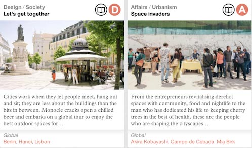
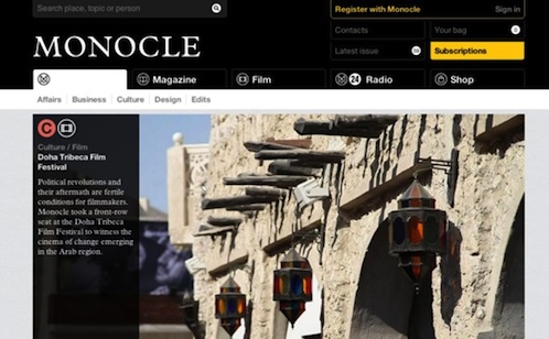
Another way to employ similarity is with organisation of page content and elements. Notice how the homepage content in Monocle.com is grouped together by the means of bounding boxes to indicate that they are are references (links) to articles, as well as the usage of different, simple icons to indicate the type of media and topics in those particular articles.
Prägnanz (Figure-Ground)
We bet you do remember during the time when Geocities first made an appearance into the world wide web, incorporating the busy tiled graphics in the background. That was until we learned it was not ideal anymore because this means the background took away the foreground objects. Basic design: Foreground objects should be more prominent than their backgrounds.
Figure-ground refers to the relationship between positive elements and negative space. Employing the principle of figure-ground ensures so that viewers will be able to direct their gaze on elements that should be more prioritised. Again, with organisation, it will also allow viewers to to see how these elements relate to one another.
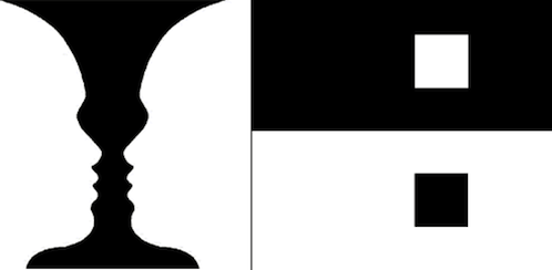
Figure-Ground: The eye will separate whole figures from their background in order to understand what’s being seen.
In the context of a web design, employing figure-ground principle shall help us to design a site where the viewers will be able to distinguish content from structure as well as understanding the importance or implications of this implied depth. This can established by utilising many visual mechanisms and styling treatments.
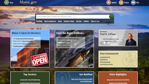
If you take a look at Maine.gov‘s website, the homepage is presented in a number of graphics, textures, colors, and shapes. However, due to the certain treatments of different elements (e.g. the background photo is made blurry) viewers are able to distinguish which ones are the content (figure) and which ones are the structure and background (ground).
Common Fate
The idea of common fate is relatively simple: We perceive items or objects moving (or appearing to move) in the same direction as related to each other, more so than elements that are stationary or appear to be moving in different directions. Those related items are sharing a common fate.

In this photo, we could perceive that the stream on the left is heading towards the viewer whilst the one on the right is heading away from the viewer. These different streams share common fate (s) – one coming towards, and another going away. Although static, the movement is clearly implied and relationships are easily formed. In design, elements that move with one another relate to one another, while elements that resist that common movement or move in a different direction, do not relate.
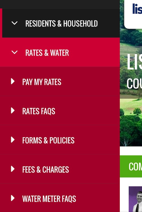
One example is by taking a look at the dropdown menu in Lismore City Council‘s mobile website. This main menu item has a slide-out sub-menu, so do the others. Hence these two items are related in our minds.
Closure
The closure principle is really about drawing conclusions. It involves seeing patterns and filling in the details by yourselves, combining parts to form a simpler whole.
The old IBM logo is a great example of illustrating the principle of closure.
IBM: You can recognise there is a letter I, B and M within the bright blue horizontal lines arranged to create the perception of these letters.
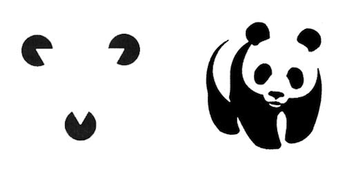
Closure: Do you see a white triangle amidst the three black Pac-Man-like shapes? Do you see a panda amidst the several random shapes?
More so than a visual outcome, closure helps to also instil storytelling in a design. The key to closure is to provide enough information so the eye can fill in the rest. If too much is missing, the elements will be seen as separate parts instead of a whole. If too much information is provided, there’s no need for closure to occur.
Part 2: People Scan, Not Read?
The way users read on the Web is different from the way they read printed pages. People rarely read word-by-word on the Web. Internet users scan a page until they find something of interest, and then they read.
The truth is people are going to skim and scan all of these content we have written on this blog post, looking for something (a keyword, a header or subhead) that catches their attention or matches the reason they’re visiting your website in the first place.
As designers and web developers, we do also understand that the Web is vast and competition is rough. Each page has to compete with hundreds of millions of other pages for user’s attention.
Another fact is that reading from computer screens is tiring for the eyes – the brightness, the many other distractions around it (social media, emails, etc.). According to Jakob Nielsen, User Advocate and principal of the Nielsen Norman Group on how users read on the Web, reading on computer screens takes 25 percent slower than reading from paper.
By now, we should be thanking you for still reading up to this point. Or are you?
Web users also have very short attention spans, they always feel like they want to consume something short and concise on the go. On top of this, the hectic modern life also contributed to the rushing. This is why people attempt to minimise the number of words they read and in as much time as possible.
As designers and web developers, we do also understand that the Web is vast and competition is rough. Each page has to compete with hundreds of millions of other pages for user’s attention.Instead of spending a lot of time on a single page, users move between many pages and try to pick the most easily digestible for their own good.
And here’s where we should utilise this sort of information to concoct a well-designed content-based site.
Some Numbers Proving That People Scan, Not Read
Various studies have been conducted to find out that people actually scan instead of reading. Here are some of them:
- According to Steve Krug in his well-received first book, Don’t Make Me Think, one of the most important fact about web users is that they don’t read, they scan.
- In his seminal web usability study from 1997, Jakob Nielsen showed that 79% of web users scan rather than read.
- Nielsen found by analysing the data in the study was that although people spend more time on pages with more words and more information, they only spend 4.4 seconds more for each additional 100 words. By calculating reading rates, he concluded that when the sentence is excessively long, people will only read 18% of it.
- Nielsen also has determined that the truth is that people don’t read very much. His recent eye tracking studies shows that less than 20% of the text content is actually read on an average Web page.
- In a usability study by Gerry McGovern, he discovered that only 1 out of 15 users could locate a specific piece of information that was not scannably placed on the page.
- In 2013, analytics vendor Chartbeat analyzed Slate and other websites and found that most visitors scroll through about only 50-60% of an article page. What’s even more interesting is that, people readily share your articles even without reading them – which proves that it seems to be no correlation between sharing and scrolling.
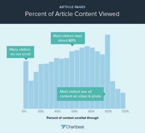
Scrolling Majority: Most visitors scroll through about only 50-60% of an article page on the Web.
Part 3: Users’ Scanning Patterns
There are several layout patterns to suggest how people scan or read through a design. Each of these diagrams do primarily one similar thing: offering advice of where to place important information. Here are some of them.
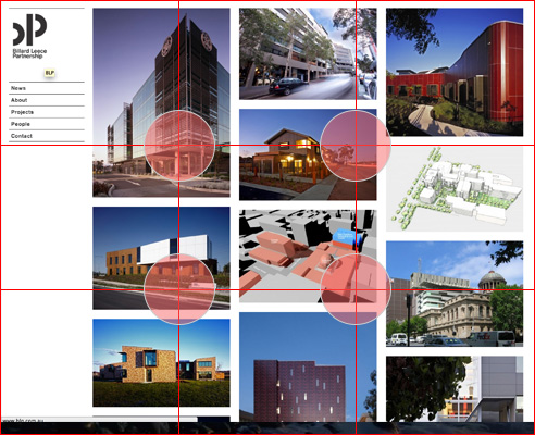
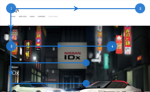
Rule of Thirds
In a related compositional practice, the “rule of thirds” places centres of interest within a grid that divides both dimensions in thirds. These compositional rules are purely pictorial, however, and are probably most useful for displays or home pages composed almost entirely of graphics or photography. Most page composition is dominated by text, and there our reading habits are the primary forces that shape the way we scan pages.
Good example of rule of thirds
- No element gets ignored or overlooked because the elements all touch the intersecting lines of the grid. The elements are all arranged and positioned in a way that makes it easy for users to capture the beauty of the product in a full single view.
- Four intersections of the lines contain exactly the information which the company wants its users to see — namely what the site is all about and an example of their work.
Bad example of rule of thirds
- Elements are not proportionally aligned with the rule of third.
- It would make it difficult for users to look at, and force them to move their eyes around the page to view each element.
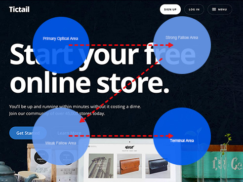
The Gutenberg Diagram
The Gutenberg Diagram, a concept popularised by newspaper designer Edmund C. Arnold dictates a display which is divided into four equal areas. These areas can help designers ensure that they are taking full advantage of a user’s reading gravity, the natural path that most peoples’ eyes will follow when being presented with information.
Primary optical area
The higher left portion of the page is the primary focus of every user, it’s where the eyes will automatically focus regardless if the user is searching for something, wanting to read or just doing a quick scan on the page.
Strong fallow area
The second stage of the reading habit is moving to the higher right portion of the page, you can think of it as a follow up from the left portion but less important. It’s not a good idea to break the reader’s experience created from the starting point. This means that if you have a call to action the user will stop at this point and act.
Weak fallow area
The lower left portion is the blind portion of the Gutenberg Diagram. Although this area is readable, users tend to not give much importance to the content in this area of the page.
Terminal area
When the user reaches the lower right portion of the page there is a break in the reading or “page scan” process and the user will need to take an action. This is the perfect spot to insert call-to-action such as buttons, links, forms, video, etc.
Good example of rule of The Gutenberg diagram
- The call to actions falls on the strong fallow & terminal areas, where these are the menus.
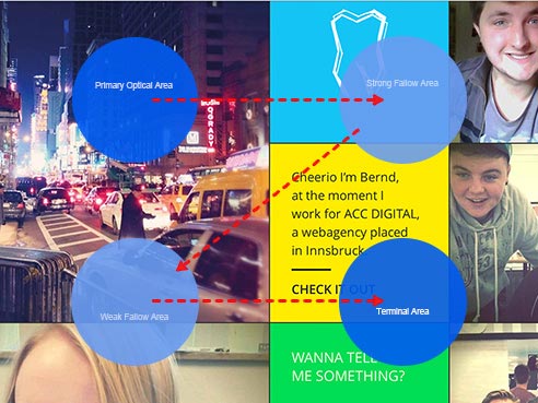
Bad example of rule of The Gutenberg diagram
- The call to action (the link) falls on the weak fallow area.
F-Shape Pattern
In F-shape pattern, it follows the principle that reading is largely done the same way that a book is read: top to bottom, left to right. Sidebar content is often dismissed below the “fold”, and usually is only scanned briefly. The bulk of the attention stays within the main content column.
Good example of F-shape pattern
- Most important information are structured at the top line F pattern
- Content is arranged by employing the F-pattern scanning behaviour
- Gives you an idea of the whole information of the website at the top of the “F”, getting you involved before you even start scrolling.
Bad example of F-shape pattern
- By using the big image as the header and much smaller font for the menus, the most important information seems dim in this website.
Zig-Zag Pattern
Naturally in Western languages, we would read from top to bottom, scanning left to right down the page in a “Gutenberg z” pattern. Using this pattern, we can extend this a little by seeing it more as a series of z-movements instead of one big z-movement.
This series of z-movements is sometimes referred to as a zig-zag pattern. If we continue to add more zigs and zags to the pattern we ultimately end up with a series of near horizontal right and left movements as the diagonal portion of the z gets shallower and shallower.
Good example of zig-zag pattern
- Eyes could easily scan the content page from left to right (Z movements) till the bottom.
- Placing important elements aligning to the end points of a ‘zig-zag’ guarantees that your visitors remember more details after they skim.
Bad example of zig-zag pattern
- Contents are all over the place and not adhering to the zig-zag pattern.
Part 4: Examples of Good Content-Based Designs
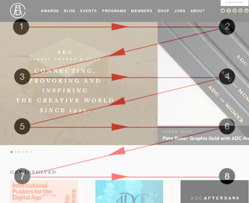
Monocle.com
Monocle.com is a global affairs and lifestyle magazine, 24-hour radio station, website, and media brand founded by Tyler Brûlé, a Canadian entrepreneur, Financial Times columnist, and previously founder of Wallpaper* magazine. While news and content-focused websites are the trickiest to tackle in design and typography, Monocle.com has done it pretty well.
- The stories are arranged collage-style, in colour codes and icons adhering to the grouping based on the principle of Gestalt.
- The website also employs sufficient usage of different types of font, icons and colours to aid navigations without being too blinding, while at the same time, being bold and experimental.
- In challenge of not looking cluttered, Monocle.com has implemented a subtle background colour to enhance the foreground content.
- Expresses the mood and the branding of the magazine real well in supporting diversity globally.
The Future of Airlines Websites
This website is a continuation of a video published by Fantasy Interactive (Fi), a digital design agency. Fi has come up with a concept design of an airline site of the future after a thorough study of all the major airline websites for their information architecture, including their visual and interaction design. It is apt that this website is targeting within the realm of user experience because it is very nicely done.
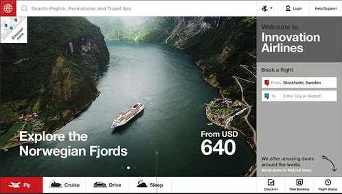
- Information are arranged in smaller chunks for easy browsing and scrolling, with a very well-structured content hierarchy.
- Minimal usage of various fonts.
- Interactive information in order to provide better understanding of how airlines websites work now vs the future.
- Easy-to-understand diagrams, with animations.
- Highly visual.
The Digital-Physical
Craig Mod wrote The Digital Physical recounting his experience in the development of the Flipboard App for iPhone. As with any large-scale projects, nights that seem to be endless – he thought, just how much does a digital project weigh? So he decided to explore the tangibility of a digital project in relation to its physical shape. Mod’s essay is beautifully written as well as nicely designed.
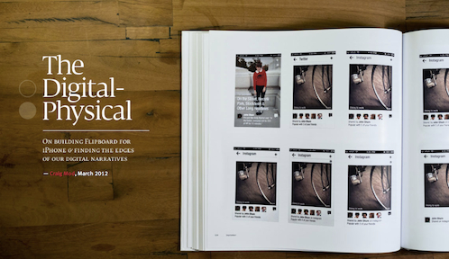
- As a guide for the lengthy article, there is an index on the right side of the site. However, if it would scroll along with the content, it would be much better.
- The accommodating visuals are there to help enhance the reading experience without being too overwhelming.
- Clear indication of citations that will lead to the reference articles at the bottom of the page.
- Mimicking magazine articles, there were also important excerpts placed within the articles as pull quotes.
- Short paragraphs for easy reading and digesting.
Mapping Place Pins
Pinterest recently launched Place Pins, where content can be saved with a location and then laid out on a map. This new feature is aimed to help users plan trips and create guides to their hometowns, in addition to what some users had been doing all this while. Mapping Place Pins is a case study behind the design process of building this feature.
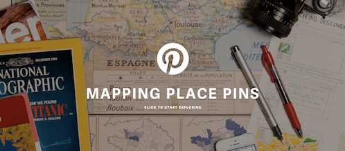
- Information is arranged in a systematic hierarchy and in smaller chunks to add reading and scrolling – introduction, meet the team, the idea, and the journey and design process.
- Huge and appropriate header image to attract attention.
- Accommodating visual featuring sketches, prototypes and behind-the-scene photos take viewers along on the process.
- The choice of font and font size could be improved in some parts.
The Great Discontent
The Great Discontent (TGD) is a magazine featuring interviews on beginnings, creativity, and risk. Cofounded by Ryan & Tina Essmaker, TGD launched online in August 2011 and has grown to include a print counterpart, a short film series, and other content-related projects and collaborations.
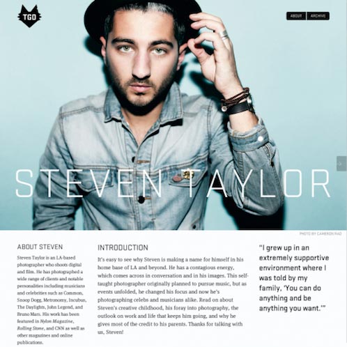
- Easily the best-designed content-based website out there, TGD articles feature big header image of the interviewee to grab the attention.
- Questions and answers are structured to seem to flow as in normal conversations, as if you are in the same room participating in the interview.
- Pull quotes to highlight the best parts of the articles.
- Accommodating visuals revolving around the interviewee, their passions and their work.
- Navigational hints are everywhere without being too much in the face.
GO Italian Street Food
Based in London, GO is a franchise of Italian street food. Its nicely designed website adds to the delight that their food is freshly made every day by their wonderful staff.
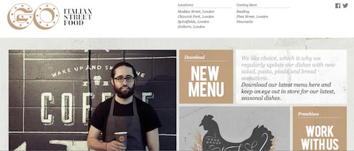
- Big, strong headline directing you to the information.
- Information are arranged in tiles for easy access. The ones in colour act as menus.
- Quirky images and illustration to fit the branding of the joint.
- Highlighted keywords for content which matter most e.g. “Contact us to discover more.”
Los Angeles Times
The leading source of news on Southern California published in 1881, Los Angeles Times offers daily news on entertainment, movies, television, music, politics, business, health, technology, travel and many more.
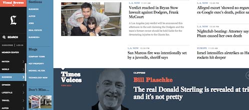
- Offers an optimum use of whitespace enough to take the clutter away.
- Grouping of menus in Visual Browse to follow the Gestalt principle of common fate.
- Colour codes to show the hierarchy of the menu as well as indicating information that needs to stand out than the rest.
- Bigger header and image to indicate featured articles.
Made by Fibb
Made by Fibb is a team of a Bernd Baumgartner, Austrian-based designer and Fabian Irsara, Italian-born developer. While this site is not largely content-based and is only built by two people, it just emits their fun personality.
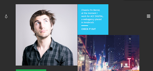
- Information and navigation are arranged in colour-codes.
- Interactivity – viewers are able to submit their own photos by taking their own pictures within the in-built camera option.
- Hamburger icon on the right to be able to filter the sort of information viewers only want to see on the site.
- Nifty little icon to indicate viewers that they are always able to return to top of the page after scrolling.
National Climate Assessment
The National Climate Assessment is a report summarising the impacts of climate change on the United States, for recent and in the future. Produced by a team of more than 300 experts, the report was extensively reviewed by the public and experts, including federal agencies and a panel of the National Academy of Sciences.
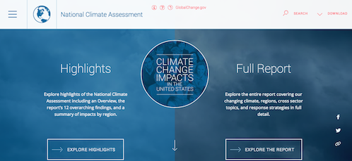
The challenge here is to make a number of seemingly tedious environment reports as interesting as possible, and the site does not fail.
- Two options to view the report: by highlights or full report offering the option for quick viewing or in detailed reading for viewers.
- Information is structured and arranged by importance of the report.
- Appropriate icons to indicate different sections of the report: climates, regions, sectors and many more.
- Bullets as indicators on the right side of the website to indicate the progress of the report as viewers read online.
- Second means of navigation is made easy by having the hamburger icon leading to a lightbox upon clicking to offer full sitemap.
Teehan+Lax case study on Prismatic
Teehan+Lax is a Toronto-based digital creative agency. They are the people behind the well-known blogging platform Medium and online reading platform Readability. If there’s one agency that would know about the best online reading experience, it has to be Teehan+Lax.
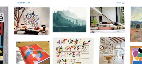
- Big headline to catch attention on first sight.
- Like many other good content-based websites mentioned here, information is very well structured with a few pull-quotes in as a way to keep the interest in reading going.
- Attractive, sometimes interactive visuals to complement the article.
Conclusions
Based on the principles of Gestalt, there are several questions that you can ask yourself before or in the middle of designing. As none of these principles stands alone and all of them function in totality with one another, it is important to check that every principle is fulfilled. As Clay Shirky puts it, “you cannot understand all of the properties of water from studying its constituent atoms in isolation.”
- Are you grouping your design elements correctly? (proximity)
- What elements of your designs are you unintentionally over- or under-emphasising? (similarity)
- How is the relationship between the positive and negative space in your design? (figure-ground)
- Are there design elements in your work that fight instead of flow together? (common fate)
- Are there any patterns that you have employed so that viewers will be able to fill and see the whole picture by themselves? (closure)
Based on the users’ content-scanning pattern, here’s how we can use them to our advantage as designers:
- Make important information stand out. Most readers will not read every single word on your website. Identify key areas you want them to focus on. This can be accomplished with the right use of typography. Using bullet points, headings and subheadings will help visitors to quickly identify key elements on your website.
- Put the most important information into those areas to ensure it gets viewed. Top left corner gets the attention first. When users land on your site, their eye path starts from the upper left corner, and moves on from there.
- Use short paragraphs or lists. Using shorter paragraphs or lists to communicate with your visitors will further help to convey your intended message and improve usability.
- Studies have demonstrated over and over again that images get higher levels of attention. Thus utilising relevant imagery for the content of your website can also help to improve its readability and contributes to the overall aesthetics of your website design.
What are other good content-based websites have you come across? Are there any other principles you have adhered in order to design the ideal websites?
Resources and References
The Principles of Gestalt
- Design Principles: Visual Perception And The Principles Of Gestalt
- Gestalt Principles Applied In Design
- Andy Rutledge’s Series of Gestalt Design
- The Gestalt Principle: Design Theory for Web Designers
On Scanning and Reading
- Understanding the F-Layout in Web Design
- Warning: Web Users Do Not Read – They Scan
- Serious reading takes a hit from online scanning and skimming
- You Won’t Finish This Article
- Myth #1: People read on the web
- The Stats Are In: You’re Just Skimming This Article
- Simple Ways to Get More People to Read Your Content
- Website Reading: It (Sometimes) Does Happen
On Scanning Patterns
- Presenting Information Architecture
- Understanding the Z-Layout in Web Design
- 3 Design Layouts
- Applying Divine Proportion To Your Web Designs
- Web Design & The Rule of Thirds
- Understanding the Split Layout in Web Design
- F or Z Pattern In Web Design?
- The Gutenberg Diagram in Web Design
- The Gutenberg Diagram in Design
