


Ecommerce Email Marketing Guide: Best Strategies, Tools & Emails to Use

Written by:
Colleen Branch

What is a landing page? Think of it as a shop window, giving first impressions that shape an understanding of your brand and the products and services you sell.
Whether you’re a startup or an established business, it’s vital to create a landing page that’s easy to comprehend and motivates people to take the action you want.
Conversely, we’ve all landed on a page, felt confused, and immediately clicked back to the search engine to look for something better.
Sometimes it’s due to a lack of trust; other times the page can appear complicated or difficult to navigate and you have no idea how to find what you came for.
I’ll let you in on a secret.
With great research, clever copy and dazzling design, creating a landing page that converts isn’t an impossible dream reserved only for big, powerful businesses. It’s achievable by anyone!
So let’s get started.
Market research is an essential step in the landing page creation process.
If you don’t know who your customers are or what motivates them, how will you entice them into buying what you’re selling? Take some time to get to know them.
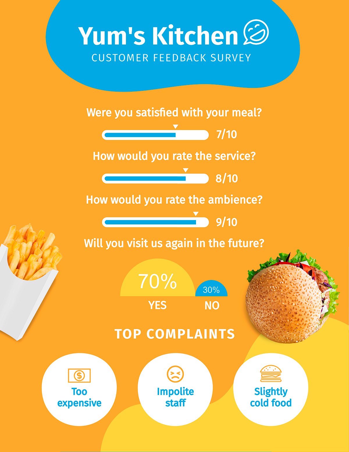
If you already have an interested audience, take advantage of that and ask them some questions about your product or service.
Whether you use a survey or ask them one-on-one, try to include some open-ended questions alongside any multiple-choice ones, and let them offload.
You can easily visualize responses using a survey results report template like the one below.
By doing this, you can find out what they love or hate in their own words. This means you can mirror the language they use, including any memorable phrases that you uncover.
So, how can this help you?
Knowing things they love or hate can help you to understand what attracts them or puts them off about your business. What they love, you can highlight on your landing page, and what they hate, you can keep off — and inform you of how you can do better.
Learning about the type of language they use when describing your product and services means that you can mirror it when talking about your product. You’ll literally be speaking their language!
When you uncover memorable phrases, you’re finding golden nuggets to use on your own website. It can help with brand messaging, headlines, and testimonials.
But more on this later.
Let’s imagine you sell beautiful cakes. On your landing page, your main goal is for customers to look at your cakes, and buy them. Take a look at your competitor’s landing pages.
Ask these questions to friends, family and colleagues. The more you learn about what’s working and what isn’t, the more you'll know what to include on your own page.
Now, it’s time to craft your overarching message. How do you want to come across? What promises do you want to make? What story do you want to tell?
There are some important rules for creating compelling copy, so let’s dive in.
This is important to realize – internet users are selfish.
They want to know exactly what they’re getting out of your product or service. When they first come into contact with your brand, they want to know the benefits and how you can help them.
You can do this by using words like you, your, and yours. This speaks directly to the user and helps them engage with what you're saying.
Great copy is all about using uncomplicated, easy-to-understand language. Keep it simple, and your sentences short and to the point. You can achieve this by avoiding complex industry terms that can act as a barrier to your message.
Try reading it out aloud – does it flow nicely? If it doesn’t, keep on editing. If you can, read it out loud to someone else, especially if they’re outside your business. This will give you a useful perspective to check that what you’re saying makes sense.
A value proposition is a key part of your overall message, and tells potential customers what makes you unique, and why they should pick you over your competitors.
Not to be confused with a catchphrase, it’s a clear sentence that sums up the essence of why you exist. Here are some examples:
Each example quickly summarizes the benefit that customers can expect from your brand and shows that the business is a solution to a customer problem. None of them are confusing, they’re simple, yet they communicate a lot.
You can use your value proposition at the top of your landing page, as one of the first things that a visitor to your website sees. It’s also a good idea to use at any consumer touchpoints, such as:
Remember, this is your introduction and you want to make a good first impression.
If you have to use industry terms, and you think an uninformed reader won’t know what they mean, make sure you also supply the information they need to understand them.
This way you’ll appear helpful, and you won’t leave people confused — or worse, frustrated at your website.
When a customer has doubts about a product or service, and they can’t find anything to relieve that doubt, they may leave your website.
Use the information you’ve gained in the audience research stage to prevent this from happening. Here are some examples of how to do it:
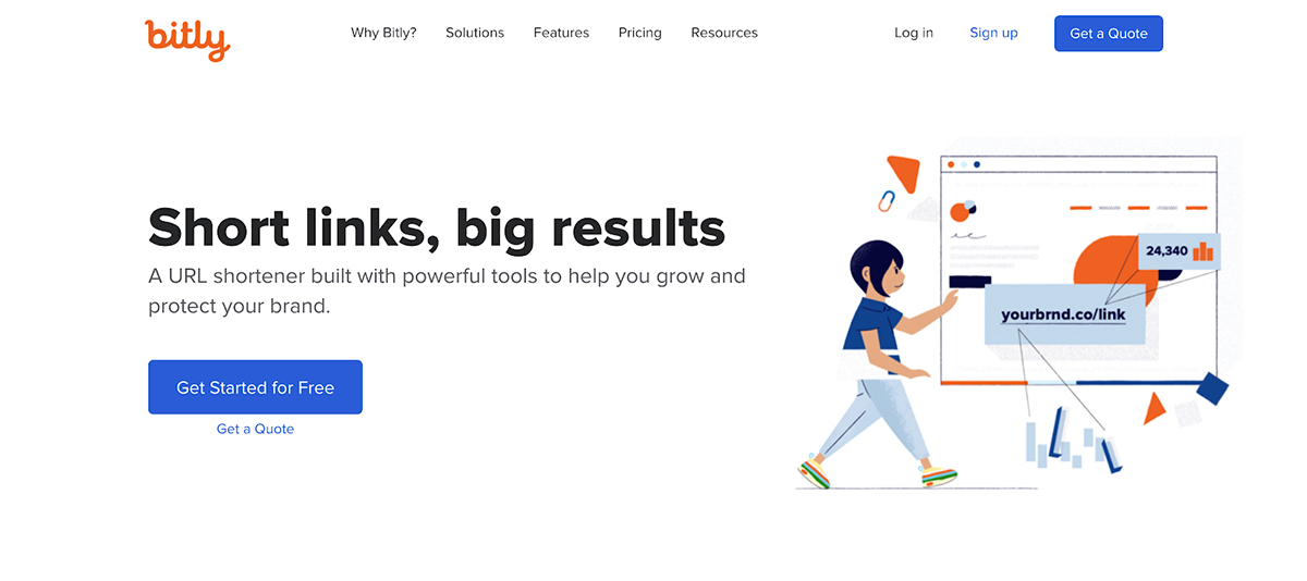
If you haven’t already got one, you’ll need a great domain name for your website.
When you’re on your domain name search, you’ll want to pick one that’s easy to remember and easy to spell. This means that it will be the same for your potential customers!
Be sure to brainstorm, compile a list of words that are related to your product or service, and feel free to get creative.
Once you’ve got a memorable name, ask your friends and family how they feel about it. They’re likely to be honest and tell you if it sounds untrustworthy or difficult to spell.
A Google study found that we decide if a website is beautiful within 1/50th to 1/20th of a second, and that complexity is detrimental to perceived beauty.
So, what can we do to our landing pages to help us succeed?
While beautiful design can be subjective, clean, simple, uncluttered landing pages are easier to digest. The easier it is to understand how to use the page, the faster it will be to understand the product or service, and the benefits to the user.
As well as creating clever copy, you can help keep a landing page clean and simple by looking at the layout, font and colors.
Take a look at Visme’s new homepage redesign as an example.

Sign up. It's free.
Create any type of website graphic with Visme!
Our eyes mostly follow an F pattern or Z pattern when we land on a webpage. This is how we scan a page and take in information, therefore your content needs to be organized accordingly.
Everything must be aligned, allowing the user to move through a flow easily and understand your message. Above the fold (in other words, everything you see before you have to scroll down) needs to be captivating visually.
Consider the hierarchy of the page. The most important information needs to be at the top, and then further down the page, the more you can say about your product or service.
We know that visually complex landing pages put people off. When choosing a palette, try to keep it to a minimum. You don’t want to overwhelm the user with a rainbow of colors.
White space can help you balance your text, images, and bring visual clarity to a page. Don’t be afraid to use it.
When it comes to design, it’s not just about the background color and images. It’s also about the user experience design (UX) and the user interface design (UI). Both types of design focus on how the user interacts with your page.
UX focuses on how users may feel or behave as they navigate around. It includes usability testing, psychological factors, wireframes, and layout. UI focuses on the look of the website, from the font and the colors to the buttons and the icons.
For example, if a user lands on your Contact Us page, they should easily find, navigate, and engage with all the details they might need. Add an FAQ section, various department contact information, or designate a point of contact for their specific issue. The easier this is, the better the user experience.
There are lots of fantastic resources online to help you learn the basics of both.
Here are a few to check out:
Have fun learning!
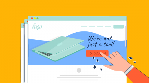
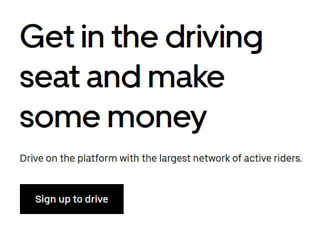
Here are some specific tips to help you create a landing page that converts.
These need to be obvious, eye-catching, and drive the user to click. Whether it’s to ‘Buy it now’ or ‘Sign up’, the copy and design should be clean and simple.
Here's an example from Uber.
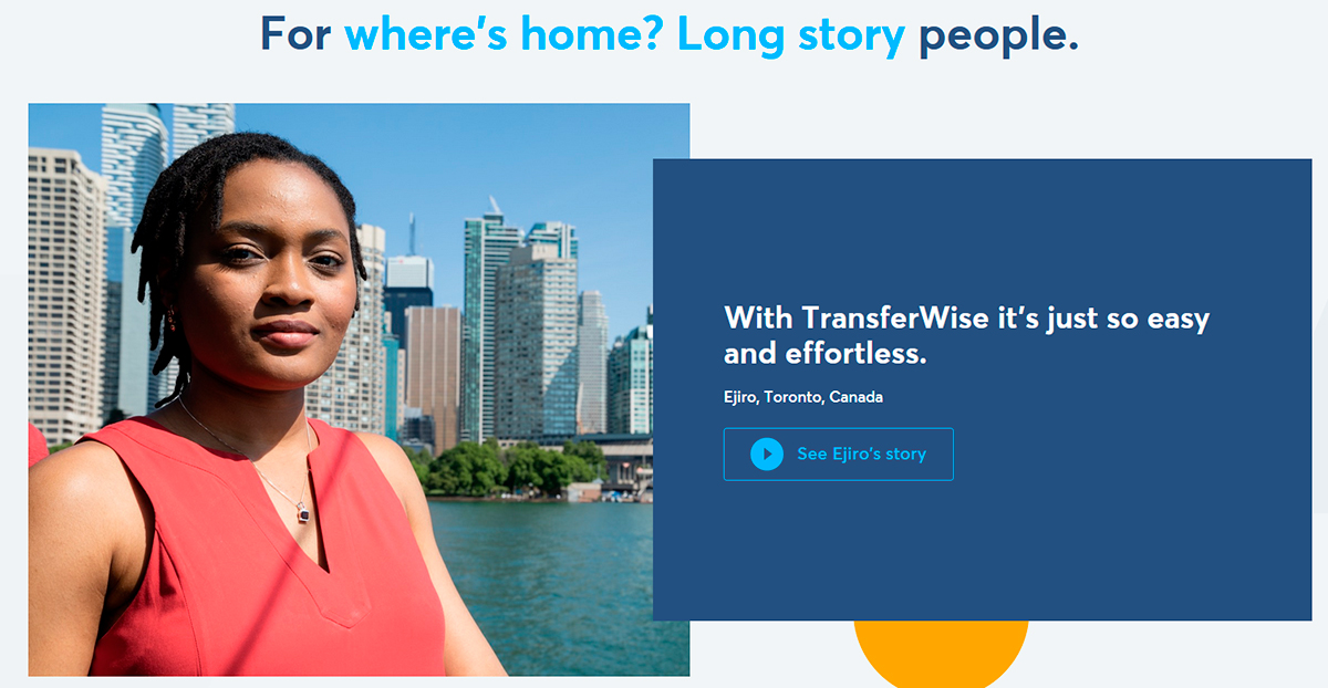
Eye-tracking studies found that stock photos of generic people were ignored.
Real images are more interesting to us. Think about how you can use these on your page. In particular, try using images of real customers for your testimonial section.
Below is an example from TransferWise's landing page.
Just because you say your customer loves it, doesn’t make it true.
Find proof, whether that’s shouting that 63,000 customers are using your product, sharing your rating from a respected review site, or proudly displaying your industry awards.
Remember those memorable phrases you found in your user testing? Make sure you pepper your site with them. If you can add the customer’s name too, that just adds more credibility.
Here's an example from gohenry.

There’s nothing more off-putting than a landing page that’s littered with mistakes.
Get someone you know to proofread and sense check it for you. Use tools like Grammarly to make sure everything is grammatically correct.

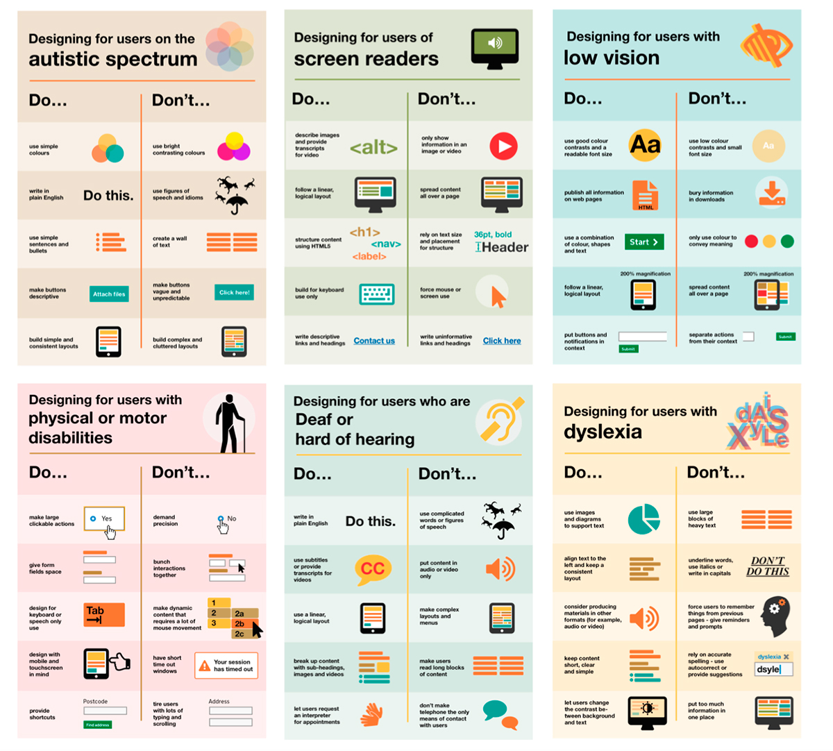
Design your landing page (and website) with accessibility in mind. For users on the autism spectrum, plain English is easier to understand, rather than figures of speech.
Users with physical or motor disabilities need large, clickable buttons, rather than small radio buttons that demand precision. Check out these incredible accessibility posters from Karwai Pun.
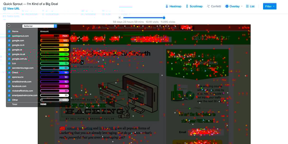
Once you’ve got your landing page created, start testing it. A/B testing compares two landing pages to enable you to see how your page is converting.
You can find out more on this subject from Crazy Egg.
If you created your landing page a long time ago it may seem scary to make huge changes to your website and try something new. Just remember — you wouldn’t have the same shop window for years, so why should your website be any different?
Sign up. It's free.Create stunning landing page graphics with Visme!
You can also take advantage of landing page creation software to build a high-converting landing page. Clickfunnels and Leadpages are two popular solutions, but there are also a lot of Clickfunnels alternatives to choose from.
Now that you know about the importance of research, clever copy, and dazzling design when it comes to creating an effective landing page, we hope you’re excited to get started.
When it comes to design, your landing pages are just one piece of the puzzle. The visuals you share across each and every customer touchpoint should be consistent with your brand.
Build a strong and consistent identity with Visme — an all-in-one visual content creation platform to help you build a powerful, visual brand.
From website and social media graphics to videos, infographics and presentations, Visme empowers you to create professional visual content easily with the help of customizable templates.
Sign up for a free account today and take it for a test drive!
Design visual brand experiences for your business whether you are a seasoned designer or a total novice.
Try Visme for free
![Top Social Selling Tools You Should Use [+ Examples]](https://visme.co/blog/wp-content/uploads/2023/09/Social-Selling-Tools-and-Examples-Thumbnail-500x280.jpg)

About the Author
Colleen Branch is a Senior Copywriter at Namecheap. She loves to write honest, clear, and concise copy, and her work interests include UX and conversion optimization. In her spare time, she likes taking photos and playing pool. Find Colleen on LinkedIn.