


6 Attractive Pink Paint Colors for the Kitchen
From soft petal pinks to fearless fuchsias, these stylish hues can dress up the room
Jennifer Ott
May 10, 2021
San Francisco-based architectural color specialist and design writer. Jennifer's work has been featured in many print and online publications. Her recently-published book, "1000 Ideas for Color Schemes," is a beautifully illustrated and easy-to-navigate guide that takes the guesswork out of selecting the perfect color palette for your home or special event. For more information on Jennifer Ott Design, visit http://jenottdesign.com/.
San Francisco-based architectural color specialist and design writer. Jennifer's... More
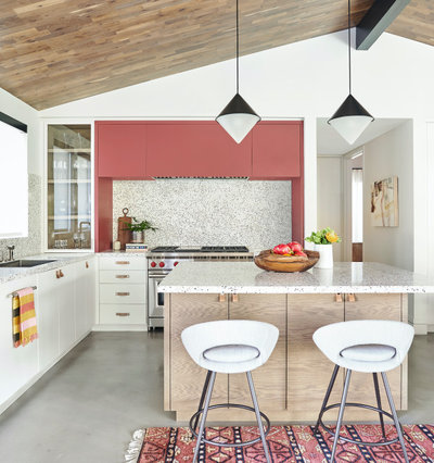
1. Raspberry Pink
My best piece of advice when selecting an accent color for the kitchen is to take inspiration from your favorite food. If you want to introduce a pink, perhaps take the color from your favorite pink-hued fruit.
Find an interior designer or decorator
My best piece of advice when selecting an accent color for the kitchen is to take inspiration from your favorite food. If you want to introduce a pink, perhaps take the color from your favorite pink-hued fruit.
Find an interior designer or decorator
The raspberry accents in the previous kitchen and the one here add so much personality to these otherwise light and neutral spaces.
And the nice thing about decorating with paint is that it’s one of the easiest and most wallet-friendly things to update down the road, should you ever experience pink fatigue.
Shop for bar and counter stools
And the nice thing about decorating with paint is that it’s one of the easiest and most wallet-friendly things to update down the road, should you ever experience pink fatigue.
Shop for bar and counter stools
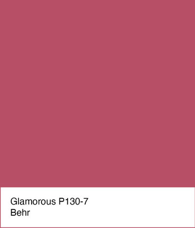
For a similar look: Glamorous by Behr is a beautiful, strong berry. It’s therefore best used in small doses in a kitchen. Use it to highlight an area you want to draw attention to, such as a window wall or the island.
2. Coral Pink
If a pure pink isn’t your jam, take a look at pink hybrid colors, such as an orange-tinged coral pink. Coral colors have a lovely, inviting, warm vibe. Having grown up in a landlocked small Midwestern town, I always think of the fun beach vacations of my youth when I see coral and shell pink shades.
Take a cue from nature and pair coral pink with soft sandy tans and warm whites.
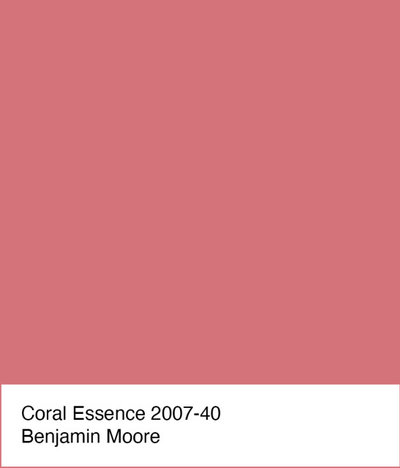
For a similar look: Coral, such as Coral Essence by Benjamin Moore, is a great alternative for those who find true pink too cloying. Just be sure to create a large test sample of the color before committing, and view it at different times of the day in the space, to make sure no undesirable undertones are present.
3. Hot Pink
I don’t know if it’s a reaction to the recent challenging times we’ve been experiencing, but I’ve definitely noticed an uptick in the use of hot pink hues in and on homes. Perhaps people are looking for ways to perk up and brighten their spaces. Whatever the reason, a little bit of bold hot pink can go a long way in creating a fun focal point in a kitchen.
I don’t know if it’s a reaction to the recent challenging times we’ve been experiencing, but I’ve definitely noticed an uptick in the use of hot pink hues in and on homes. Perhaps people are looking for ways to perk up and brighten their spaces. Whatever the reason, a little bit of bold hot pink can go a long way in creating a fun focal point in a kitchen.
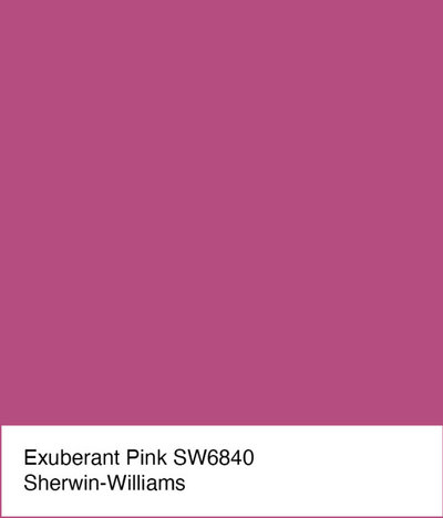
For a similar look: Of all the colors presented in this article, Exuberant Pink by Sherwin-Williams is the boldest and brightest. I recommend using it with restraint, such as for a small accent area on a wall or in a niche. Because it’s so eye-catching, be sure to employ it on something worthy of the attention.
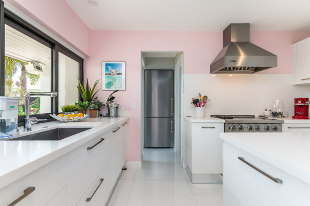
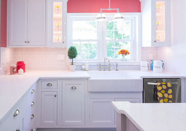
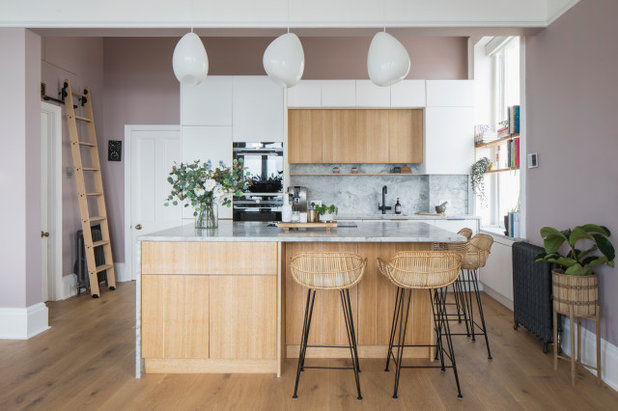
4. Pale Pink
After the previous example, it’s time to take it down several notches and show examples of how to use softer, paler pinks in a kitchen.
After the previous example, it’s time to take it down several notches and show examples of how to use softer, paler pinks in a kitchen.
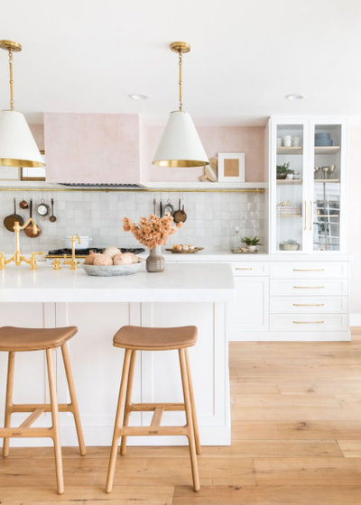
Because these pinks are so light and soft, they can be used as a slightly more colorful alternative to white. Indeed, the palest of the pinks are considered “off-white” hues, or whites that have subtle pink undertones.
These pale pinks are super pleasing to the eye. They add a hint of comforting warmth, perfect for those in cool or gloomy climates, but they aren’t so overly warm that they would be unwelcome in hot climates.
These pale pinks are super pleasing to the eye. They add a hint of comforting warmth, perfect for those in cool or gloomy climates, but they aren’t so overly warm that they would be unwelcome in hot climates.
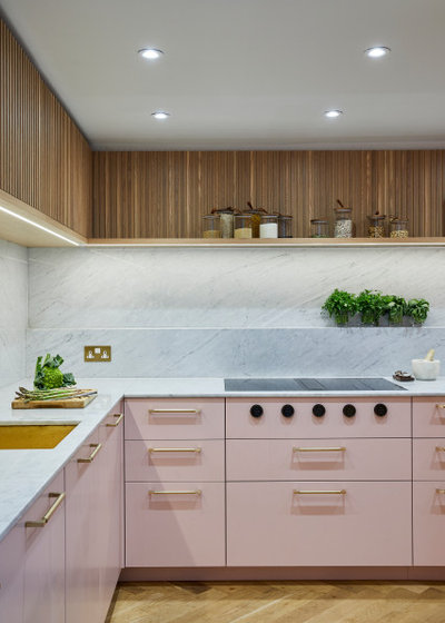
Think pale pinks make a kitchen appear too juvenile? Try pairing the soft pink hue with warm woods, gold metallics and natural (or natural-look) stone for an elegant, sophisticated space.
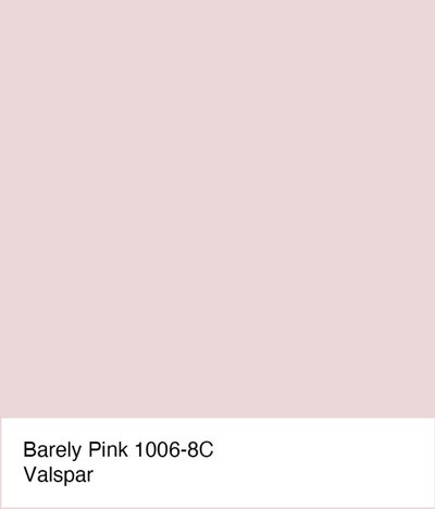
For a similar look: A soft pink like Barely Pink by Valspar adds a nice pinch of color without being overwhelming. These hues work well in any style space, from traditional to transitional to modern.
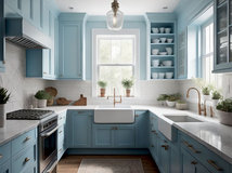
5. Muted Pink
Here’s another hue that’s more of a whisper than a shout of color. It’s a lovely pink-gray-purple hybrid that can almost work as a neutral due to its muted quality. This is one of those shades that’s constantly shifting — it may appear pink, purple or gray — depending on the time of day and quality of light. I can see this hue working well as a warmer alternative to true gray.
Here’s another hue that’s more of a whisper than a shout of color. It’s a lovely pink-gray-purple hybrid that can almost work as a neutral due to its muted quality. This is one of those shades that’s constantly shifting — it may appear pink, purple or gray — depending on the time of day and quality of light. I can see this hue working well as a warmer alternative to true gray.
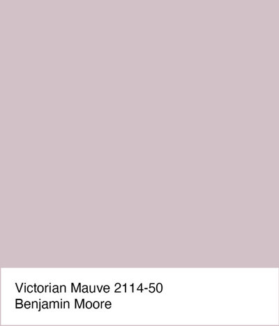
For a similar look: Victorian Mauve by Benjamin Moore is a pink-purple with a good amount of gray in it, which helps nudge it into neutral territory, meaning you can more easily go for a larger splash of it in a kitchen. It also plays well with many other colors, from eye-popping reds and oranges to soft blues and greens.
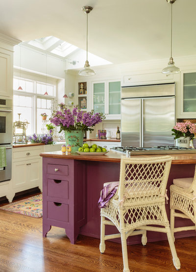
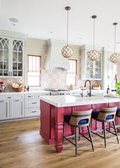
6. Plum Pink
This saturated purple-pink is a nice alternative to hot pink for those who want a bold dose of pink but need a color that works well with more traditional or transitional spaces.
The plum-pink island in this charming kitchen is a gorgeous focal point. When paired with dashes of organic green, it creates a lovely, blooming garden vibe.
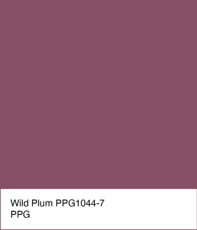
For a similar look: A pretty purple-pink hybrid such as Wild Plum by PPG is bold and colorful but also has an elegant quality to it. Pair it with creams, warm whites and medium to dark wood tones for a traditional look. Or go more modern by combining it with crisp white and graphite or navy blue.
Your turn: Are you a fan of pink in the kitchen? Which shade is your favorite? Tell us in the Comments.
More on Houzz
Read more Color stories
Hire a kitchen remodeler
Shop for kitchen products
Your turn: Are you a fan of pink in the kitchen? Which shade is your favorite? Tell us in the Comments.
More on Houzz
Read more Color stories
Hire a kitchen remodeler
Shop for kitchen products


We design, build and renovate in the most exquisite of fashions. Our team of revolutionaries is dedicated to... Read More
What are you working on?


Related Products
At Winks Remodeling & Handyman Services, your satisfaction is our main priority. Since our business started... Read More
Related Stories

Decorating Guides
Design Pros Share 10 Favorite Creamy White Paints
By Becky Harris
These off-white color choices include versatile tones, warming hues and pleasingly soft shades
Full Story

Kitchen Countertops
What Kitchen Countertop Colors Should You Choose?
By tidgboutique
Consider these popular colors and styles to get the look you want — no matter what material you use
Full Story

Colors of the Year
Pantone Picks a Peach for Its 2024 Color of the Year
By Jennifer Ott
See how to use this juicy hue to create calm yet flourishing spaces inside and outside the home
Full Story

Decorating Guides
5 Ways Designers Are Working With Rich Warm Tones Right Now
By Becky Harris
Interior designers describe their strategies for using rich warm colors to create an inviting home
Full Story

Colors of the Year
10 Paint Colors Ready to Take Over in 2024
By Jennifer Ott
Blue is huge, but dark hues and warm tones also find favor among major paint companies’ 2024 Color of the Year picks
Full Story
Decorating Guides
How to Mix Colors and Make It Work
By tidgboutique
Don’t want to confine yourself to neutrals but lack the confidence to embrace colors? Check out this pro advice
Full Story

Events
7 Color Trends for 2024 at Maison & Objet
By Claire Tardy
New harmonies and unexpected pairings at the fall 2023 trade fair set the tone for next year’s interiors
Full Story

Decorating Guides
9 Ways to Layer Warm Neutral Colors for Comfortably Refined Rooms
By Becky Harris
Design pros share advice for building an inviting palette, introducing high contrast and mixing textures
Full Story

Decorating Guides
How to Create a Cohesive Color Flow Throughout Your Home
By Erin Carlyle
Designers share eight techniques for avoiding a choppy feeling in your spaces
Full Story

Decorating Guides
How to Get Your Ceiling Paint Color Right
By tidgboutique
Here’s how to tweak the shade of your ceiling paint to get the effect you want
Full Story
Well, I love *all* of these pinks. I actually grew up in a 50's ranch with a pink kitchen because it was the only color my mother ever considered appropriate for that room. By the time I was around high school age, she thought about a color change but had no idea what else to try. I suggested yellow, and she went with it. But pink was always the obvious choice.
This article is wonderful! I love pink. I have a gray kitchen and have accents of pink.
Our newly purchased 1996 house (signed 10/20, protracted move, still settling in) came with extensive cultured marble kitchen counters and island -- in pale pink! The tile floor also has pink tones. The areas covered are too much to think about re-doing especially in a pandemic, so we have come to live with them. Oh did I mention all of the walls are very pale mint green? As we are in southeast Utah near the Four-Corners, I have gone with a Native American theme for the open-plan kitchen and eating areas, where the pink verges on coral and the mint shades to turquoise. It is working!