The Pandemic Is in Tenuous Retreat
New COVID-19 cases, hospitalizations, and deaths all dropped this week.

The good news in COVID-19 data continued this week, as new cases, hospitalizations, and deaths all dropped. For the seven-day period running January 28 to February 3, weekly new cases were down more than 16 percent over the previous week, and dropped below 1 million for the first time since the week of November 5. This is still an astonishing number of new cases a week, but far better than the nearly 1.8 million cases reported the week of January 14. Tests also declined nationally, but by less than 3 percent, nowhere near enough to explain the steep drop in cases.
Hospitalizations have fallen rapidly for the past two weeks, but we have a long way to go: The United States now has about 91,000 people hospitalized with the coronavirus as of yesterday, down about 40,000 from the country’s peak in early January, but still three times as many as before the fall/winter case surge.
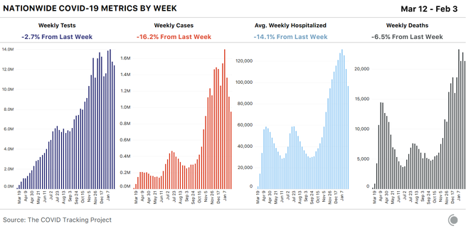
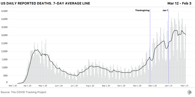
January was the pandemic’s deadliest month so far, but reported COVID-19 deaths declined this week—the first weekly drop since mid-October that is not correlated with a holiday reporting period. Despite the decline, deaths remained arrestingly high: 21,288 were reported in the past seven days. The seven-day average for reported deaths is about 3,000 deaths a day.
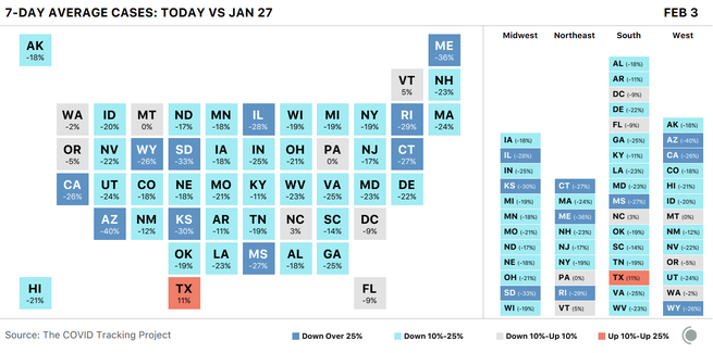
The good news we’re seeing at the national level continues to reflect the reality of most U.S. states as well. Ten states saw drops of more than 25 percent in new cases in the past week, based on the seven-day averages for January 27 and February 3. In another 32 states, new cases declined by at least 10 percent, and only a single state—Texas—posted a double-digit increase in the same period.
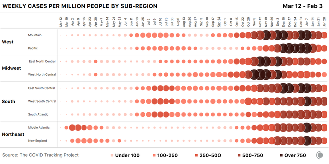
These case declines are very welcome, but are taking place against a backdrop of very high viral transmission. Despite the past three weeks of precipitous drops, U.S. cases are still about three times higher than the previous lows following the summer’s Sun Belt surge—and even during those lows, the United States was still reporting an average of more than 30,000 cases a day.
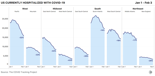
Improvements continue in COVID-19 hospitalizations as well. Since the beginning of the year, we’ve seen hospitalization declines ranging from 33 to 44 percent in the Midwest, the West, and one part of the South—the East South Central subregional division, which includes Alabama, Kentucky, Mississippi, and Tennessee. The populous nine-state South Atlantic division has posted both the highest peak—in absolute numbers, not adjusted for population—and the smallest decline, at 14 percent.
Death reporting is extremely sensitive to holiday reporting delays—we saw substantial drops and recoveries in the seven-day average after Thanksgiving, Christmas, New Year’s Day, and Martin Luther King Jr. Day. Now, however, reported deaths appear to have entered a genuine decline, reflecting the drop in cases and hospitalizations.
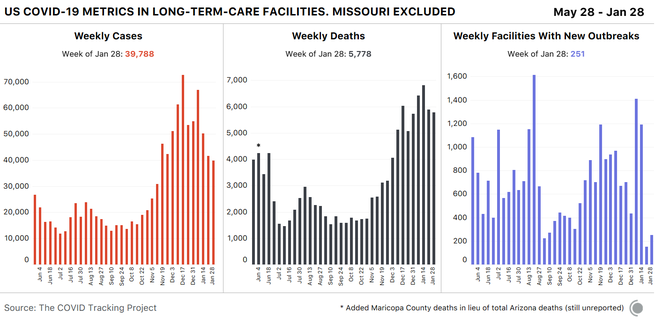
Cases and deaths in American nursing homes and other long-term-care facilities appeared to spike in our most recent week of data for these facilities, which runs January 22 through January 28—about a week behind our main data set. This rise is an artifact of a reporting anomaly, however, due to Missouri’s release of cumulative long-term-care data, for which the state provided no historical time series. If we omit all 10,343 of Missouri’s cumulative cases and 1,087 cumulative deaths from last week’s data, we can see that the number of new cases and deaths associated with LTC outbreaks actually decreased slightly over the previous week.
The race and ethnicity data we collect from states also show improving trends set against ongoing inequities. As we found in a recent analysis, in most states, the racial and ethnic groups at higher risk of contracting or dying of COVID-19 have not changed, although the relative risk is lower than it was earlier in the pandemic. New cases per capita are declining across most communities we’re able to track, but disparities in the groups mostly likely to test positive—which in most U.S. states are Black, Latino, and Indigenous people—have not gone away. We have yet to see comprehensive action directed at addressing disparities in risk or outcomes in the United States. Available vaccine data are still missing important demographic information, but the data we do have show substantial inequities in the rollout so far.
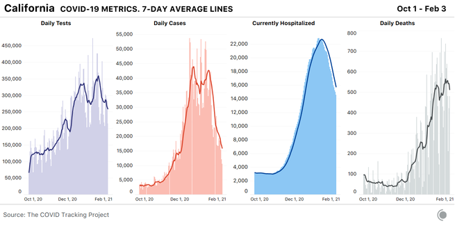
California’s massive winter outbreak continues to ease. Cases and hospitalizations are dropping fast, and the seven-day average for reported deaths has begun to drop as well. Tests, too, are down considerably in California: On the seven-day average, about 100,000 fewer tests are being done each day in California now than were being performed a few weeks ago. In Sacramento County, testing sites are using only a third of their total capacity. The statewide decline is likely in part a result of reduced demand following a drop in infections, but a sharp drop in testing is not what we’d like to see in a state where hospitalizations are still very high and multiple variants of SARS-CoV-2 are confirmed to be circulating. Statewide, genomic sequencing has discovered 133 cases of the B.1.1.7 variant first identified in the U.K., with a larger concentration in Southern California, and more than 1,000 cases of B.1.429 and B.1.427—the variants first identified on the West Coast. In the Bay Area, a new variant originating from Brazil has been identified.
January was the deadliest month of the pandemic for California, with 14,940 deaths, bringing the state’s cumulative death count to 41,000. One in every 1,000 Californians has died from the virus. Most of these deaths occurred in Los Angeles County, which has reported more than 17,000 total deaths and an average of about 6,200 new cases a day over the past week. At the same time, L.A. County deaths among Latino people are occurring at three times the rate of white people, and Latino deaths due to COVID-19 are up 1,000 percent in the county since November. The country’s first two federally administered COVID-19 mass-vaccination sites will open soon in California—one at the Oakland Coliseum and the other at California State University at Los Angeles. Both locations were chosen for their proximity to the communities most harmed by the pandemic, according to Jeffrey Zients, the coordinator of the Biden administration’s COVID-19 response. California Governor Gavin Newsom announced last week that the state’s vaccine allocation will soon prioritize residents 65 and older—rather than essential workers or younger people with underlying medical conditions, leading disability advocates to argue that health officials are neglecting vulnerable populations in a quest for greater efficiency.
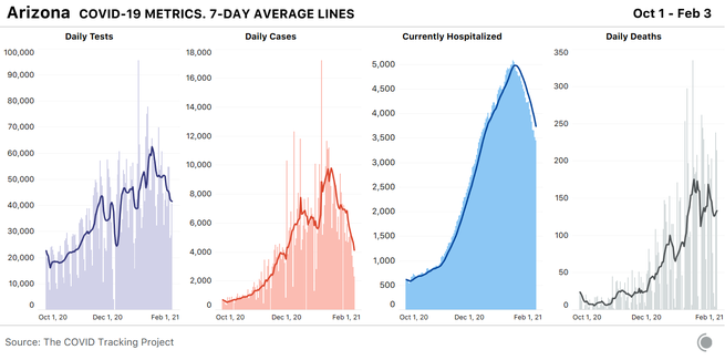
Arizona still has the highest per-capita COVID-19 hospitalizations in the country, despite several weeks of hospitalization declines—a testament to how high the state’s numbers really were at the peak of its current outbreak. More than half of all ICU beds (53 percent) and 40 percent of inpatient beds were occupied by COVID-19 patients as of February 2. The state’s official positivity rate continues to decline; last week’s 16 percent was the lowest since Thanksgiving, and the partial data for this week are at 14 percent.
Arizona communities with high Latino and Indigenous populations are disproportionately affected, according to an in-depth report by The Guardian. Yuma County, which is home to many immigrants who live in communal housing, leads the state in cases per capita. In Coconino County, residents of the Navajo Nation make up only 26 percent of the county’s population, but have accounted for 77 percent of the county’s deaths. More than two-thirds of those who have died of COVID-19 on the Navajo Nation have been tribal members over the age of 60. The CDC ranks Arizona in the bottom 20 percent for vaccine doses administered per capita. The state’s restaurants, bars, and gyms remain open, and many schools (including state universities) are holding in-person classes.
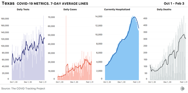
In Texas, hospitalizations are declining, reflecting improvements in some regionalized outbreaks, but they remain very high. Texas is the second-most-populous state in the country and is now fourth in the U.S. for COVID-19 hospitalizations per capita. This translates to a lot of people in the hospital with the virus: about 11,000 today, compared with California’s 14,500. New-case reporting remains erratic in Texas, and appears to be very closely tied to fluctuations in testing, which suggests that the state is still not doing enough tests to keep pace with the virus.
Laredo, a border city in South Texas, has been one of the hardest-hit hot spots nationwide for weeks and continues to suffer under the increased demand on its only two hospitals. The Texas Tribune reports that the state’s vaccine distribution is partially based on the number of health-care workers in each region, resulting in decreased allocation to Laredo’s 260,000 residents, more than 95 percent of whom are Hispanic, with nearly one-third living below the poverty line.
Some residents and workers in Texas long-term-care facilities have yet to get their first doses of vaccines, and only 2 million of the 8 million eligible Texas residents have received vaccines so far. In the state’s prison system—where two in every 1,000 Texas inmates have already died of the virus—5,500 vaccine doses have been administered to health-care workers and correctional staff, but the state has yet to administer a single dose to eligible inmates. According to The Texas Tribune, the Texas Department of Criminal Justice has “repeatedly refused to provide information on when or how its older or medically vulnerable incarcerated population will be vaccinated.”
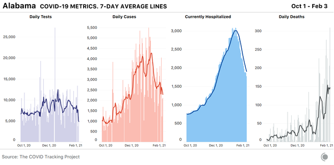
Alabama’s hospitalizations per capita are in the top 10 for the U.S., but the state is reporting by far the highest number of COVID-19 deaths per capita in the country. Alabama’s reporting has never been smooth, and it’s likely that backlogs play a role in the state’s soaring death numbers, but we will continue to watch the state closely. As of February 2, approximately 1 percent of the state had received a full series of vaccinations, although the numbers reported by the state do not perfectly align with the numbers reported by the CDC. On February 8, Alabama will open vaccine distribution for more than 1 million people—those 65 and older and frontline workers—despite the fact that demand already outpaces supply.
Worryingly, New York—the country’s fourth-largest state by population—now has the second-highest per-capita hospitalizations for COVID-19, which means we’ll continue to keep a close eye on the Empire State.
After compiling and analyzing state and territorial COVID-19 data for almost a year, we are now in the final phase of our work and will shut down data collection on March 7. Until then, we will continue to publish daily updates to our data and share our weekly analyses. Once data compilation has ended, our researchers will spend two more months documenting and analyzing state and federal data before the project winds down in May. You can learn more about our plans—and our reasons for ending our work—in our announcement post from earlier this week.
The Atlantic’s COVID-19 coverage is supported by grants from the Chan Zuckerberg Initiative and the Robert Wood Johnson Foundation.