

This post was brought to you with help by MightyDeals
MightyDeals provides daily deals for web designers and developers. They can get you discounts up to 97% off on products and services for web professionals. Read about MightyDeals
1. Skeleton
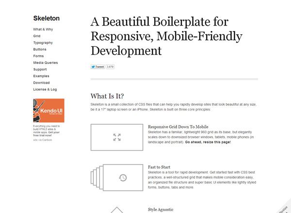 Skeleton is a collection of CSS files for web designers who need to rapidly produce responsive grid layouts. More than just a grid system, Skeleton also offers a few basic features for dealing with common web layout tasks such as a CSS reset for normalizing your CSS.
2. Neat
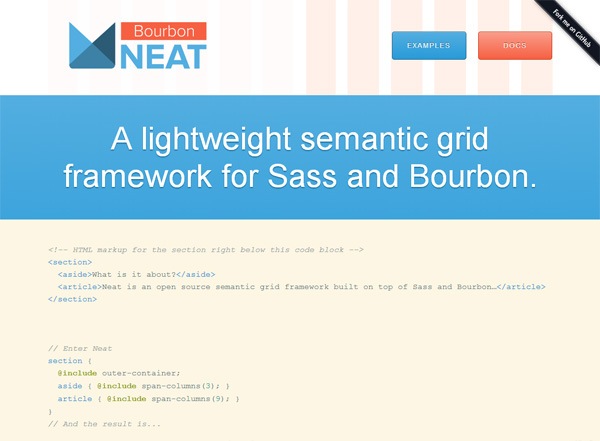 The primary objective of the Neat grid framework is to promote clean semantic HTML markup by using Sass mixins to avoid excess presentional classes and wrapping
 div elements. Get started with Neat by reading through their docs and studying some examples.
3. Simple Grid
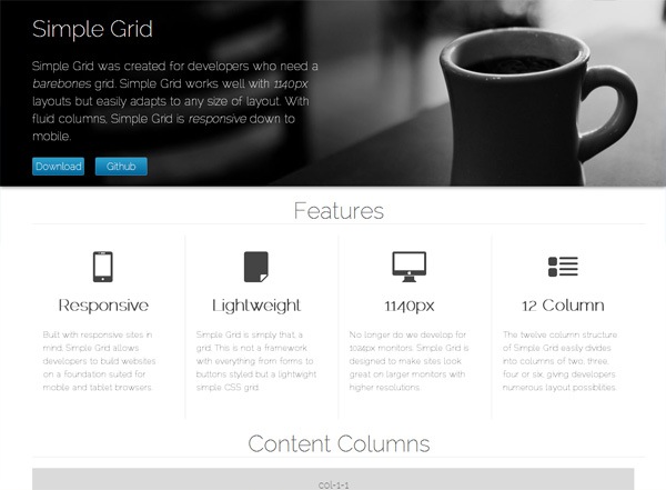 If you’re a minimalist, then Simple Grid is a system to check out as it aims to provide you with the bare-minimum you need for creating a responsive CSS grid layout. Also, 1140px is the base width of Simple Grid, not the more-common 1024px, because the Simple Grid creator believes that we’ve outgrown that convention.
4. csswizardry-grids
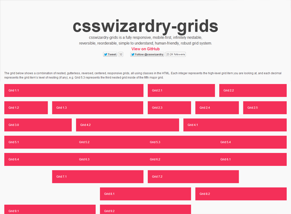 This responsive grid system’s approach is to go about designing web layouts mobile first. Similar to the Neat philosophy discussed earlier, if you’re concerned about populating your markup with an overabundance of presentational CSS classes, then you have the option to uses Sass’s
 @extend feature with csswizardry-grids.
5. Profound Grid
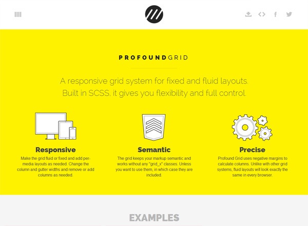 One of Profound Grid’s unique features is that it’s precise in rendering your fluid grid layouts in all the browsers it supports. How does this responsive CSS grid system achieve such a feat? By using negative margins to calculate column dimensions.
6. Griddle
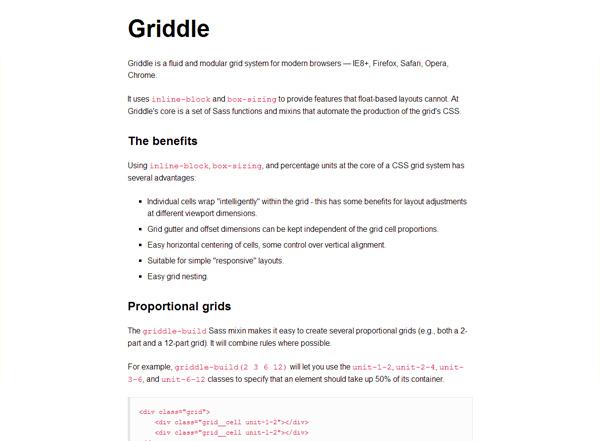 Griddle is for web designers and websites that put the focus towards modern browsers. This CSS grid system is generated using Sass functions and mixins. It leverages the powers of CSS
 inline-block and box-sizing properties, which gives your layouts some new abilities that traditional float-based layouts can’t provide you.
7. Extra Strength Responsive Grids
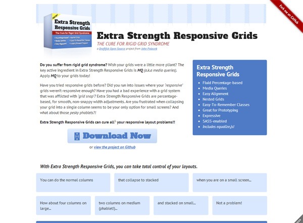 If you feel that other CSS grid systems are too constraining, if your priority is utmost control over how your responsive layout adapts to the user’s viewing screen, if you care about well-named CSS classes in your markup, you absolutely need to look at Extra Strength Responsive Grids.
8. Proportional Grids
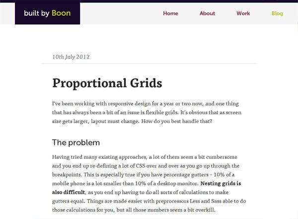 This CSS grid solution solves the problem that often arises when we rescale our layouts; disproportionate sizes of gutters between different viewing situations. Proportional Grids allows you to use fixed units of measurement for your gutters, while still being able to have fluid columns.
9. Dead Simple Grid
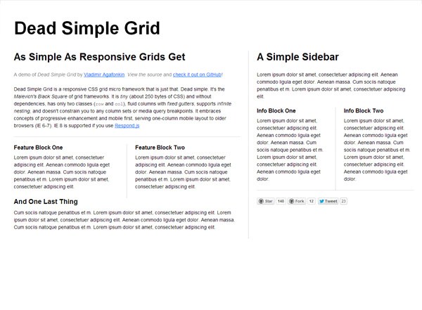 This CSS grid is a lightweight at only 250 bytes. If you just want an uncomplicated responsive grid and nothing more, and if you care a lot about front-end web performance, this tiny grid framework, which only has two CSS classes, is the ticket to your needs.
10. Responsive Grid System
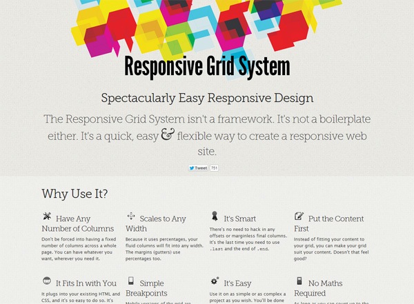 The Responsive Grid System affords you a bit more flexibility compared to other CSS grid systems because it gives you the the choice of using any number of columns you need. Say goodbye to restrictively dictatorial 12-column or 16-column grid systems if you go this route.
11. rwdgrid
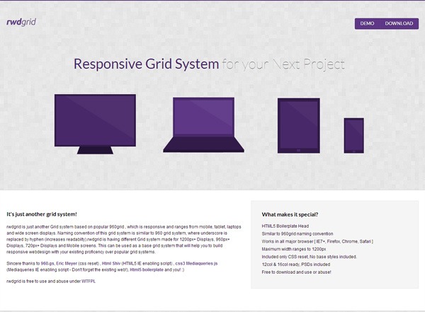 If you’re familiar and comfortable with the most popular grid system out there, 960 Grid System, then rwdgrid — a responsive CSS grid that uses 960 Grid System’s syntax and philosophies — is worth a peak.
12. CSS Smart Grid
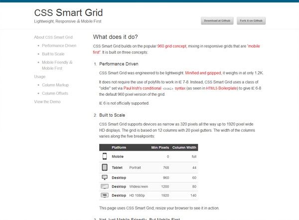 CSS Smart Grid builds upon the 960 Grid System by using a mobile first, responsive approach to grid layouts. Oh, and it’s only 1.2KB.
13. Gridlock
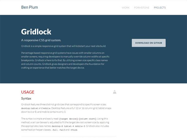 Gridlock illustrates a truly mobile first approach to web design by reversing the typical responsive web design media query logic — it doesn’t apply “desktop version” CSS properties to your HTML elements unless they’re needed, thereby possibly improving rendering speed a tad bit on mobile browsers (because the browser doesn’t need to overwrite any style rules aimed at desktop screens).
Responsive CSS Grid System Comparison Table
* Contributors is the number of people contributing to the open source project on GitHub. ** Interested is the number of Watchers the project’s repository has on GitHub.
What Responsive CSS Grid Do You Use?
Do you use a responsive CSS grid system? Talk about it in the comments!
-
 Trevin serves as the VP of Marketing at WebFX. He has worked on over 450 marketing campaigns and has been building websites for over 25 years. His work has been featured by Search Engine Land, USA Today, Fast Company and Inc.
 -

WebFX is a full-service marketing agency with 1,100+ client reviews and a 4.9-star rating on Clutch! Find out how our expert team and revenue-accelerating tech can drive results for you! Learn more
Make estimating web design costs easy
Website design costs can be tricky to nail down. Get an instant estimate for a custom web design with our free website design cost calculator!
Try Our Free Web Design Cost Calculator
Table of Contents
- This Post Was Brought to You with Help by MightyDeals
- 1. Skeleton
- 2. Neat
- 3. Simple Grid
- 4. Csswizardry-grids
- 5. Profound Grid
- 6. Griddle
- 7. Extra Strength Responsive Grids
- 8. Proportional Grids
- 9. Dead Simple Grid
- 10. Responsive Grid System
- 11. Rwdgrid
- 12. CSS Smart Grid
- 13. Gridlock
- Responsive CSS Grid System Comparison Table
- What Responsive CSS Grid Do You Use?
Share this article


Web Design Calculator
Use our free tool to get a free, instant quote in under 60 seconds.
View Web Design CalculatorMake estimating web design costs easy
Website design costs can be tricky to nail down. Get an instant estimate for a custom web design with our free website design cost calculator!
Try Our Free Web Design Cost Calculator